Tipsy Together
UX / UI Development
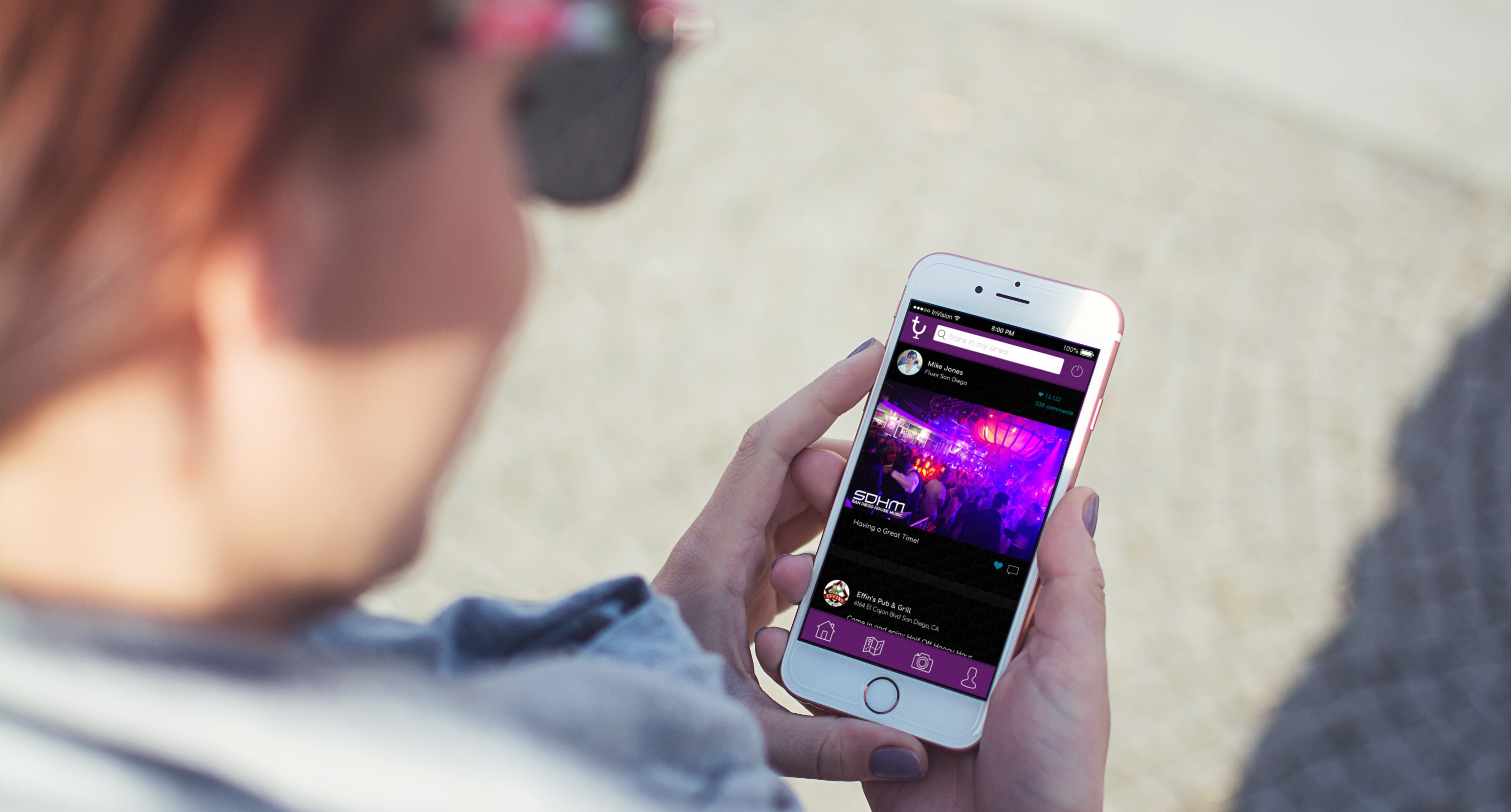
Tipsy Together App Interface
The focus of the Tipsy Together app was to build a social community where people could freely gather information about nightlife and happenings in their area. We sought to create a way for people to share their experiences at a bar or club with others on a temporary basis. It would solve the problem of having to weed through old ratings of a bar that may not still be relevant. We aso wanted to make an easy way for you to invite your friends out with you or show off to your friends at home what missing out on.
The result was an app that lets you share photos of and comment on the atmosphere of the bar you’re at. Two problems we needed to solve were to create an interactive element that would produce a habitual need to use the app and secondly, to create a map that would be helpful in getting you to your destination for the night.
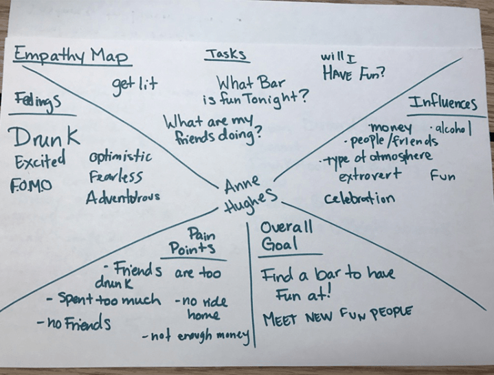
Before production of the app, the team set out to gather information on demographics of user, brainstorm specific functions of the app, and stratigic ways to implement the features we wanted into the app. After we came up with all the components for Tipsy Together, we looked at potential problems we would run into and sought to solve them before we began designing.
Potentional issues were:
Replaceable by/too similar to facebook
Rewards not worth using
Rating game not motivation enough to rate a bar
Solutions to implement:
different because it combines all the apps you would need for a night out (yelp, maps, and facebook) into one easy to access location. Also have the capability to share on facebook so people who don’t have the app can still see your photos and is also great advertizing to get the Tipsy Together app.
Rewards are tailored to the specific places you go so you’ll never get a coupon that you won’t want to use.
We appealed to people’s want to collect things and added badges when you rate bars as further motivation to use the app
With these solutions we began to design the app.
Process
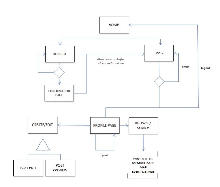
Our first step in designing Tipsy Together was to create the paper prototype. We layed out the main components like the login and newsfeed screens, then continued to fill in the rest of the neccessary elements. When the paper prototype was complete we began testing.
Solution
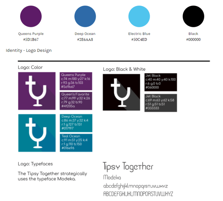
Keeping with the similar elements from our style tiles we created the style guide which layed out the consistant elements to be used on the app. Our goal was to create a fun usable app. Using these we put together the app.

Copyright © David Cantrell 2019